The Stress Less Logo Redesign: Rebuilding a 7 Year Old App
I went back to an app I built seven years ago, and it was time to rebuild it.
The app is called Stress Less. I made it in 2019, the first real iOS app I ever shipped. It’s getting a full redesign, a full rewrite under the hood, and a chance to finally become the app I originally wanted it to be. This post is about the new look, the reasoning behind the rebuild, and where it’s headed.
The backstory
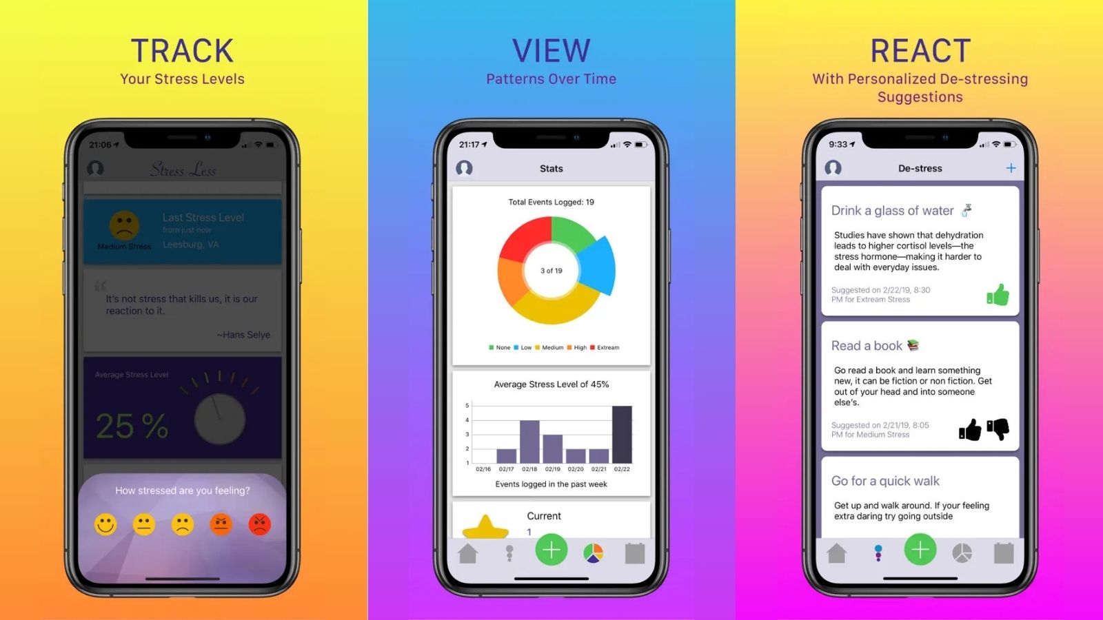
I built Stress Less in 2019. It was simple by design. Log how you’re feeling, see your stress patterns, and get a small reset idea, like “count three orange things in the room.”
There was also a more ambitious version of the idea in my head. The plan was to use those daily logs to predict when stress was coming and offer the right reset before it hit. The prediction piece was always the goal. I just didn’t have the time, the skills, or honestly the right tech to pull it off in 2019. So the version I shipped was the simple one.
I did some light marketing when it launched. A few posts on socials, nothing big. Then I let it ride and moved on to other things.
What I didn’t expect was that people would keep finding it. Every week, on average, a few new users download Stress Less. They find it through App Store search, mostly because the name says exactly what the app does. A handful of therapists have recommended it to their clients over the years too, which was a surprise to me.
Why Stress Less needed a rebuild
When I sat down with the old app this winter, three things were obvious within five minutes.
-
The design was a different era. The app was my first production iOS app, built while I was still figuring out what mobile software should feel like. Bright gradients, busy color palettes, a script font for the wordmark. None of it was bad in 2019. All of it is loud in 2026.
-
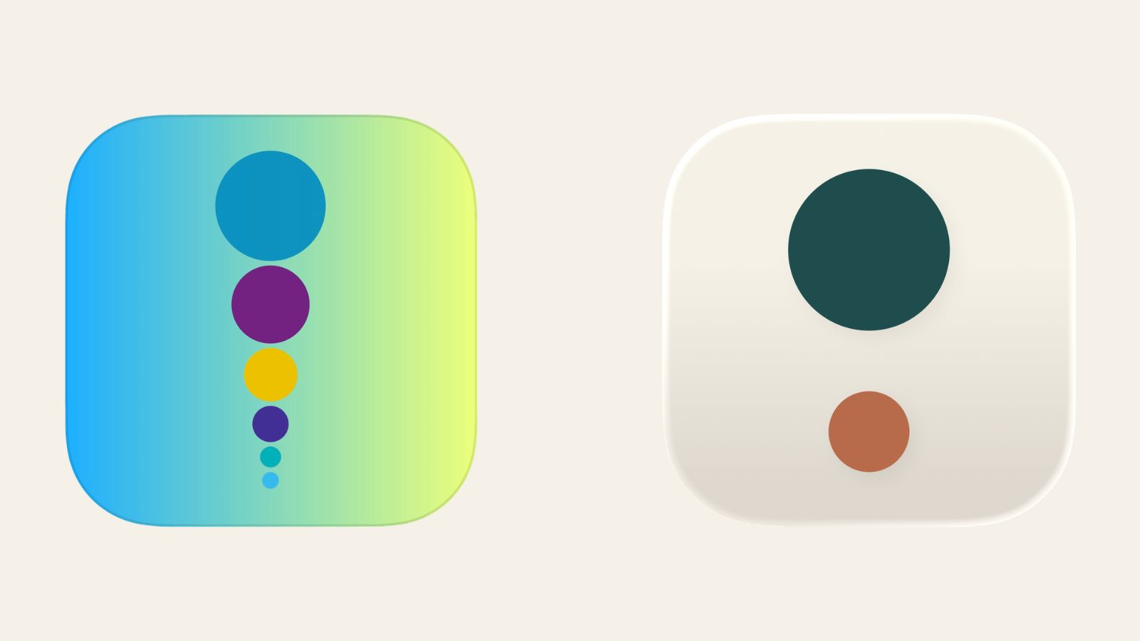
The brand had no through-line. The logo was a stack of six dots in different colors that I’d liked at the time. The wordmark was a script font that fought with the rest of the interface. The palette, the voice, and the type had each been decided on their own, at different times, so nothing tied them together.
-
The core idea was still right. Stripped of the visuals, the underlying mechanic landed. Log how you feel, see what’s stressing you out over time, get small reset ideas. Reviews and emails from users over the years kept coming back to the same word: simple. People liked it because it didn’t ask much.
So the rebuild isn’t a pivot. It’s the version of this app I wanted to build from the beginning.
The new look
Stress Less now has a deliberate identity. Three pieces define it.
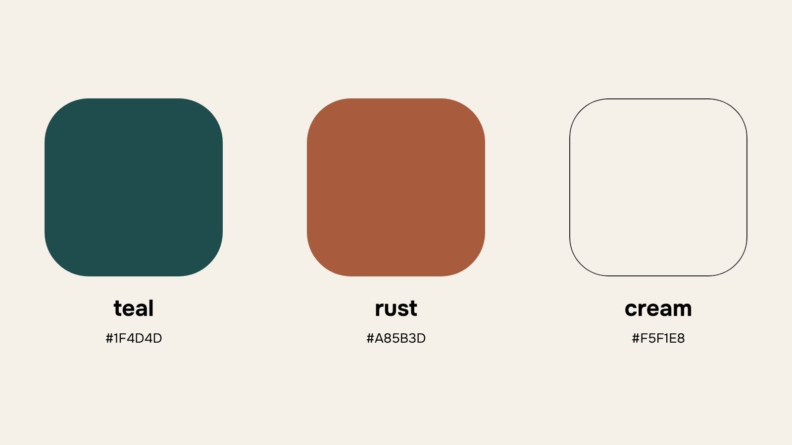
The palette is cream, deep teal, and rust. Cream sits as the background because clinical white feels stressful on a stress app, the way fluorescent light feels at the DMV. Deep teal is the primary brand color, used for headlines and buttons. It carries steadiness and confidence without going cold. Rust shows up sparingly, a single accent that adds warmth without competing with anything else. The whole palette is supposed to feel like a worn paperback rather than medical software.
By the way, the site you’re reading this on uses the same palette and font. What you’re looking at right now is what the rebuilt app is going to feel like.
The new logo is two stacked dots. One larger dot in deep teal, one smaller dot in rust below it. It’s a simplified evolution of the original six-dot stack, with seven years of editing behind it. Where the old logo said “lots of things going on,” the new one says “two things, in balance.” That feels more aligned to what the app is trying to do.
The new font is called Onest, a humanist sans-serif that’s friendly without being childish. No more script font.
The full identity is supposed to feel like the app feels when it’s working: quieter, more grounded, easier to live with.
What’s changing besides the logo
The rebuild is end to end. The whole app is being rewritten in Flutter, which lets me ship faster as a solo developer and gives me a path to other platforms later. The check-in mechanic is staying. A quick stress log still takes seconds.
The biggest shift is what happens after the log. The original Stress Less had text-based suggestions, things like “go for a walk” or “drink a glass of water” with a short paragraph of context. They worked for some people in some moments, but reading about a walk isn’t the same as actually doing one. The new version is designed as something you can open in a stressed moment and use for practical relief in under five minutes. Audio, guided breathing, visuals, actual de-stress experiences you do inside the app instead of text suggestions you read and bookmark for later.
The pattern-finding side is also getting a real upgrade. Patterns, triggers, and summaries that turn your entries into something you can actually see. That’s the foundation for the bigger goal.
The original idea was a Stress Less that learns your patterns over time and gets better at predicting when stress is coming, then recommends the kind of reset that actually works for you based on how you’ve reacted in the past. I want to be careful about what I promise here. Some of that lands in the first version, some of it lands in future updates. The point of starting over is that the rebuild is the floor that makes any of it possible. The old codebase couldn’t get there.
Stress Less relaunched August 18, 2026
Stress Less relaunched August 18, 2026.
If you’ve used Stress Less before and stopped because it felt dated, give the rebuilt version another look. If you’re new, the timing is good.
Stress Less is available now on the App Store.
Related reading
- What Is a Wellness Journal? A Daily Practice for Less Stress
- How to Spot Your Stress Patterns and Use Them
- The Different Kinds of Stress and How to Tell Them Apart
Written by Dave Faliskie, with AI assistance for research and editing.
Stress less, one check-in at a time
Track what’s weighing on you, get a quick relief action, and start noticing the patterns behind your stress.

More from the blog

How to Keep a Stress Journal That Shows Your Patterns
A stress journal is a short daily log built for spotting patterns. Here's what to put in each entry, and how a stress score turns entries into a number.

How to Manage Stress at Work: What Actually Helps
Nearly half of US workers feel tense during the workday. Here's what causes work stress, what helps in the moment, and when it's more than stress.

Beat the Sunday Scaries: 7 Small Resets That Actually Work
The Sunday Scaries are real and predictable. Here are 7 small resets that quiet the dread before Monday, plus what's behind that Sunday-night knot.